Deirdre Breen
Deirdre Breen is an Irish artist who lives and works in Cork. After graduating from the Limerick School of Art and Design in 2008 with a degree in visual communications, Deirdre worked for the next few years as a creative designer in London and Dublin. In 2016 Deirdre developed her printmaking practice and exhibited throughout Ireland. Her practice focuses on form and colour by playing with abstract geometric compositions and colour theory.
‘Bandfield’, 2019, Site-specific Mural, Cork City. Photo credit: Deirdre Breen
How did you get started?
I originally studied Visual Communications in Limerick School of Art & Design. After I graduated, I moved to London for a few years and worked there as a Graphic Designer before moving back to Dublin in 2013. As a student, and throughout my career, I’ve always been inspired by modernist designers who maintained a practice in both fields of art and design — people like Max Bill, Johannes Itten and Herbert Bayer. They took a set of principles and explored them extensively in many art forms such as architecture, painting, advertising and typography. I’m fascinated by themes that are common to both — colour theory, geometry and mathematics. In 2016 I came to a point where I wanted to explore these areas more freely, without a brief or set of strict parameters, and get away from the computer and back to making work with my hands. I did an introduction course in screen-printing, not a hugely uncommon medium for graphic designers who want to make their own work. I was hooked on the process from the get-go and the effects that can be achieved — beautiful clean lines and intense depths of colour. I think it really appeals to designers who work with commercial printers.
‘Whirligig’, 2017, Screenprint, 470mm x 650mm. Photo credit: Damn Fine Print
‘Tiptoe’, 2017, Screenprint, 470mm x 640mm. Photo credit: Damn Fine Print
‘Brutalism’, 2017, Screenprint, 470mm x 640mm. Photo credit: Damn Fine Print
Can you take us through your art making process?
My work is inspired by shapes, form and geometry. I’ll often begin with photographs of buildings and architecture from places I’ve visited and observed. I’ll isolate and deconstruct elements of the image, identifying forms within structures and reducing them to their most simplest shapes. I’ll start sketching the shapes, playing with size and colour and exploring the interrelationships of these forms. Generally, I’ll have themes set in mind for these exercises — repetition, gradation, contrast, radiation, concentration, volume and many others. Once I start to see something interesting happening, I’ll move onto the screen where I have more freedom and capacity for geometric compositions. I’ll loosely select colours before creating my stencils. Once I’m ready to start testing the colours I’ll move to the print studio. The process can vary depending on the print, but I find my colour decisions always change in the print studio. Colour really is a bottomless pit of possibilities, and I find the testing part of the process the most invigorating and exciting aspect. I get such a buzz off it.
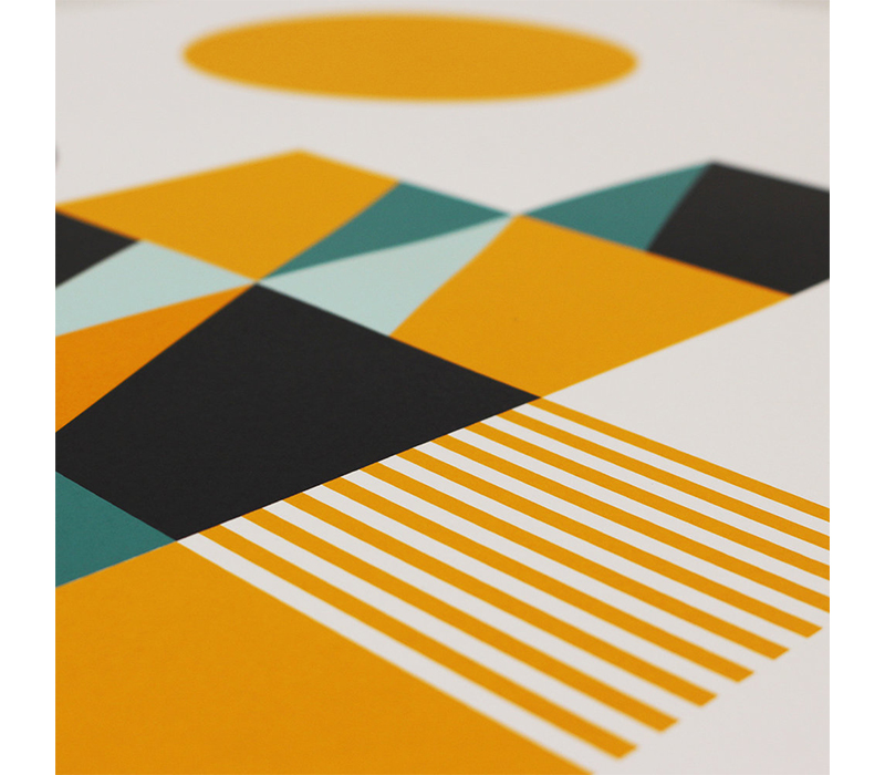
‘Barrio’ (Detail), 2017, Screenprint, 470mm x 640mm. Photo credit: Deirdre Breen
Can you elaborate on how you use form and colour theory in your work?
I use forms as flat planes or lines, sometimes they are organic and irregular but for the most part geometric. Forms can encounter one another in numerous ways, and I’ll begin by playing with how two or more shapes can relate to each other. I’ll look at colour distribution at the same time, observing how changes in colour can affect the relationship between any two shapes. I’m a massive fan of Josef Albers, and his book ‘Interaction of Colour’ is my favourite text on colour theory. I love his experimental approach. He advocates that we experience colour through making. I try to adopt a similar process of ‘practice before theory’. I test colours and observe how they make me feel first before committing to a final palette. I’ll look at how colours interact, playing and tweaking their characteristics such a brightness and lightness, and observing the effects these changes have. In the words of Patrick Scott ‘there’s no such thing as a bad colour, just bad combinations’. It’s so true. A colour can be totally transformed depending on the colour it sits alongside.
‘Eclipse’, 2016, Screenprint on Paper, 29.7 x 42 cm. Photo credit: Deirdre Breen
How does your design background and working from a computer inform your artwork?
It’s a big part of my practice. Because of my design background my work is very much informed by a systematic ideation process led by form, symmetry, proportion and repetition – these are all details a designer would consider when making work. The language and tools I use are more in line with the design world than the art world. In many ways it starts out quite organised and structured, with definite lines of enquiry worked up on screen – once I’m in the print studio that can sometimes change. There’s always new ways of seeing that can often only happen through process and play.
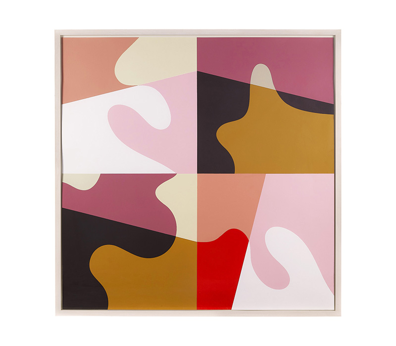
‘Stalemate’, 2018, Screenprint, 100 x 100 cm, The Devlin, Dublin . Photo credit: Deirdre Breen
‘Tidal’, 2018, Screenprint, 100 x 100 cm, The Devlin, Dublin . Photo credit: Deirdre Breen
What other techniques do you use?
This year I was invited by the Glucksman in UCC to create a large-scale site-specific public artwork in Cork City Centre. The project entitled ‘Bandfield’ was a painted mural that wrapped an old ESB substation directly across from the main gates of the University. It was my first experience of street art and spray painting. While the work was still informed by a rigid grid structure, the painting and process was a lot more fluid and flexible than anything I’ve done before. I enjoyed the physicality of it too.
‘Bandfield’, 2019, Site-specific Mural, Cork City. Photo credit: Deirdre Breen
How do you challenge yourself artistically?
By exploring new mediums. With ‘Bandfield’, I had never made art to that scale before, or for the public, so it was a steep learning curve with so many new and different things to consider. Making art in an area that is so public gave me a very different perspective on my work and what people take from it. It was a really insightful and light experience, and conversations with the public about art was the most meaningful part.
I also feel collaboration is a great way to challenge yourself. Over the past two years I’ve collaborated on two major projects — a series of screen-printed concrete artworks with Concrete Forest as part of a two-person show in The Doswell Gallery, Rosscarbery, and a collection of rugs designed with Ceadogán Rugmakers. I love the learnings that I get from a collaboration. It’s a huge unknown at the start which can be daunting but exciting. I think it’s important to try materials that I’m drawn to our curious about, and see how the work translates.
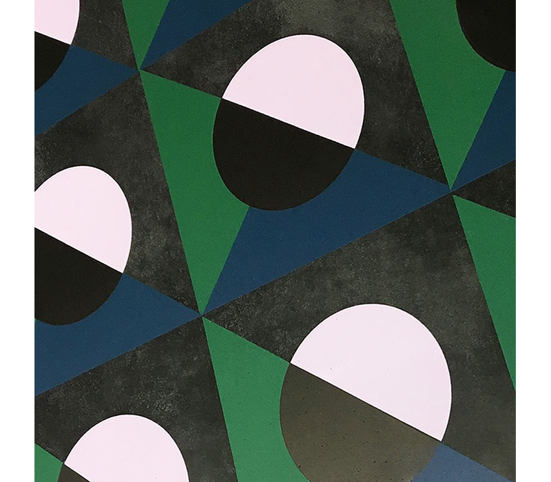
‘Odyssey’, 2018, Screenprint on Concrete, 70 x 70 cm, Collaboration with Concrete Forest, Doswell Gallery, Cork. Photo credit: Deirdre Breen
‘Totem’, 2018, Screenprint on Concrete, 70 x 70 cm, Collaboration with Concrete Forest, Doswell Gallery, Cork. Photo credit: Deirdre Breen
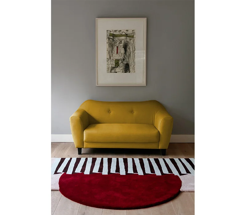
You have recently produced a series of rugs 'Ripple Effect' with Ceadogán rugmakers. Can you elaborate on the concept and design process behind your rugs??
The concept for the collection was born from a shape that is often central in my work – the circle. I’m continuously drawn to it’s self-contained form. In my art practice I’ve explored ideas of roundness, continuity and rotation, but I’m also curious about it’s concept and significance to humanity – our sun and moon and the celestial events that occur in our sky. The vernal and autumnal equinox are events that I’ve looked at in an earlier series of prints. The rug collection with Ceadogán was an opportunity to celebrate the circle, and together we created a series of rugs that expressed it’s beauty. Some of the pieces have irregular shapes and curved edges. Colour was also really important, and we spent a lot of time testing combinations and palettes early in the process. The yarn can be very different on the spool to when it’s tufted – hue and brightness can change a lot.
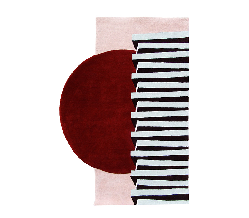
‘Locomotion’, 2019, Wool Rug, 1670mm. Photo credit: Ceadogán
‘Locomotion’ (Installation), 2019, Wool Rug, 1670mm. Photo credit: Ceadogán
‘Brainstorm’, 2019, Wool Rug, 2150mm x 1460mm. Photo credit: Ceadogán
‘Brainstorm’ (Installation), 2019, Wool Rug, 2150mm x 1460mm. Photo credit: Ceadogán
What do you want viewers to take away from your work?
I’d love for them to feel emotional about shape and colour.
Plans for the future?
My immediate plans are to get back into the print studio. It’s been a busy few months with new collaborations and off-site projects, so I’m looking forward to refocusing on the process of printmaking, and seeing where that takes me. As my art practice has developed, my Graphic Design work has been ongoing. At some point in the near future I’d like to go on residency abroad, to take some time out to reflect and experiment and potentially use it as a starting point for a new body of work that could culminate in a show.
Left to Right: Blackout’, ‘Odyssey’, ‘Interplay’, 2018, 70 x 70 cm, Collaboration with Concrete Forest, Doswell Gallery, Cork. Photo credit: Deirdre Breen


